Advil
Guidance on pain relief solutions
Guidance on pain relief solutions
Role
UX/UI Designer
Project Type
Website
Date
2022
Contribution
Web design, User testing, CMS
Context
Advil needed to catch up with their competitors: Tylenol and Bayer. More than 80% of website traffic comes from mobile users (particularly from in-store), that wasn't having a great experience with their previous websites. I mentioned websites, because they had 4 different of them, one for each type of products, and they need to centralize all information in one place.
My Role
As product designer, I worked with UX architecture, testing and UI delivery phases, across the whole lifecycle of the project that took 8 weeks to complete, in a very fast-paced environment.
My Role
As product designer, I worked with UX architecture, testing and UI delivery phases, across the whole lifecycle of the project that took 8 weeks to complete, in a very fast-paced environment.
The Challenge
The challenge set was: quickly provide pain relief guidance while always thinking mobile first.
The Challenge
The challenge set was: quickly provide pain relief guidance while always thinking mobile first.
The Challenge
The challenge set was: quickly provide pain relief guidance while always thinking mobile first.
The client also gave us 3 mindsets from research by The Health Hub about users who visit the Advil website: what triggers drive users to the website?
"I want to learn about this specific problem"
"I want relief from an immediate issue"
"I have questions about a specific problem"
The client also gave us 3 mindsets from research by The Health Hub about users who visit the Advil website: what triggers drive users to the website?
"I want to learn about this specific problem"
"I want relief from an immediate issue"
"I have questions about a specific problem"
The client also gave us 3 mindsets from research by The Health Hub about users who visit the Advil website: what triggers drive users to the website?
"I want to learn about this specific problem"
"I want relief from an immediate issue"
"I have questions about a specific problem"

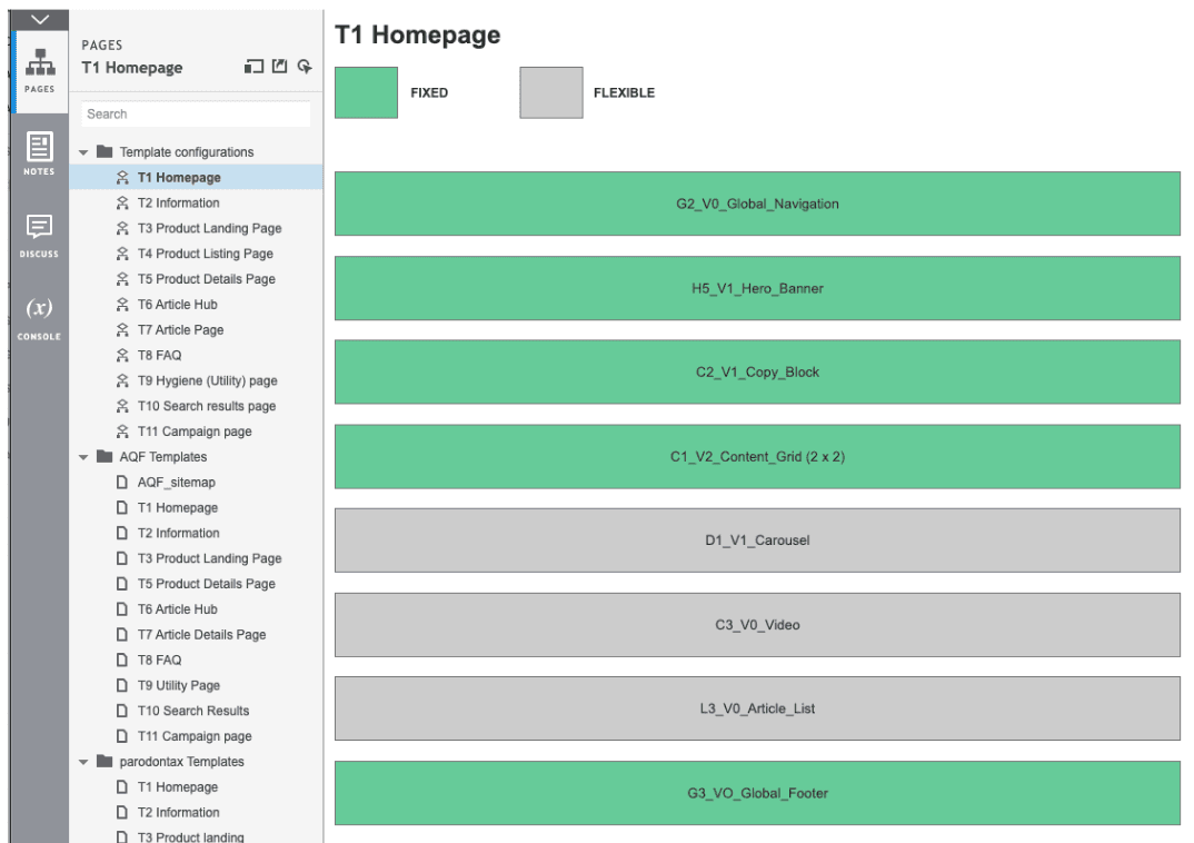
Infrastructure Backbone
The new website should be build on top of a AXURE library of components, so this was an important UI constraint to keep in mind since the early phases of design and development.
Infrastructure Backbone
The new website should be build on top of a AXURE library of components, so this was an important UI constraint to keep in mind since the early phases of design and development.
Context
The Filtrete Smart app was around since 2016, and in 2020 we proposed an update in the UX & UI to accommodate new types of information that came with connecting new smart devices. For that, the design team created a new design system that was able to allow easy maintenance while we audit the whole app experience.
UX Design Phase
From the 4 previous websites a single sitemap was created to fit all information about products, problems, side effects, covid-19, where to buy and other utility infos.
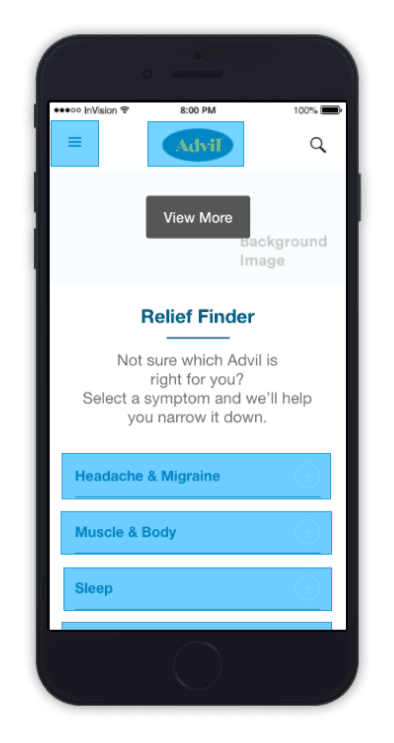
Since here, the main insight to help people find the right information quickly was set: The Relief Finder.
UX Design Phase
From the 4 previous websites a single sitemap was created to fit all information about products, problems, side effects, covid-19, where to buy and other utility infos.
Since here, the main insight to help people find the right information quickly was set: The Relief Finder.
UX Design Phase
From the 4 previous websites a single sitemap was created to fit all information about products, problems, side effects, covid-19, where to buy and other utility infos.
Since here, the main insight to help people find the right information quickly was set: The Relief Finder.

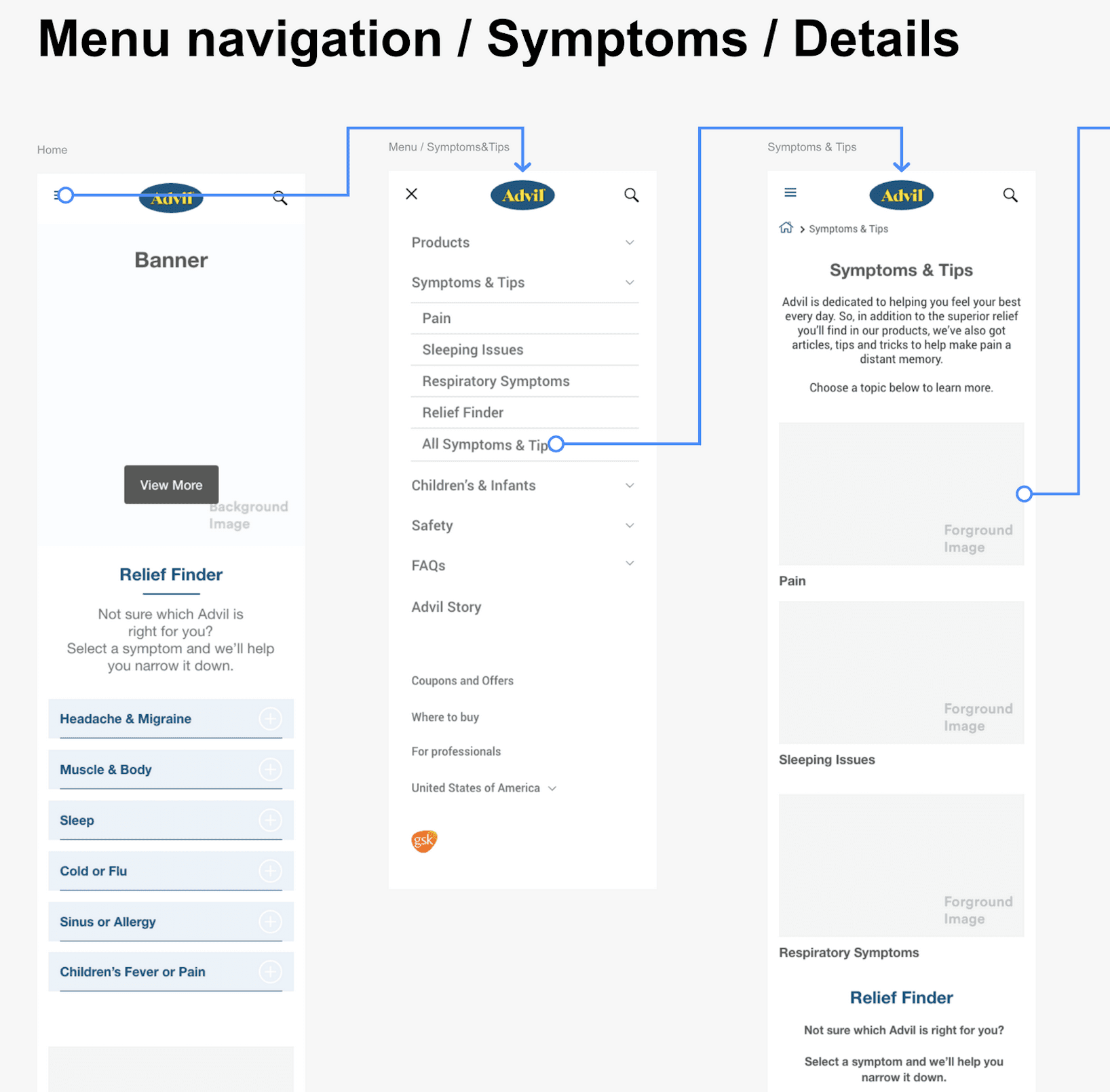
Wireframing Phase
With the components library and the sitemap set, was time to draw some boxes and arrows. The Relief Finder was at the core of the experience, from where users can quickly find answers for the questions.
I created a couple of options, and the final option was decided after a series of client meetings to polish the granularity of depth they needed for the information displayed.

Main Menu & FAQ's
Another core features of the website were the Main Menu at the left top, and the FAQ pages. The biggest effort on this project was to fit 4 different FAQ's structures from the different websites into a single place. After many iterations and feedback rounds, we had a first version for user testing.

User Testing
Since we're not testing a final product but a wireframe with no images and only mocked copy, a moderator gave previous context about the project and followed the task completion.
Also we asked questions about their main concerns with health and pain relief. In total, we run this test according to Normal Nielsen rule that we need no more than 5 people to get sufficient qualitative data.
Users should be able to complete 3 main tasks:
Find the Right Advil product to a given health issue.
Look for information on this product;
Find an answer to a specific question about the product they find.
Test Findings:
Overall, most users where able to complete most of the tasks, and the areas we find that expectations were not met, we defined the optimizations to be implemented on final design.
Test Findings:
Overall, most users where able to complete most of the tasks, and the areas we find that expectations were not met, we defined the optimizations to be implemented on final design.
Test Findings:
Overall, most users where able to complete most of the tasks, and the areas we find that expectations were not met, we defined the optimizations to be implemented on final design.

UI Phase
Based on the testing results, we adjusted the UX and moved forward using the Advil brand guidelines and the AXURE infrastrucute to build the final UI, targeting the AA WCAG compliant for accesibility, and usability and best practices.
UI Phase
Based on the testing results, we adjusted the UX and moved forward using the Advil brand guidelines and the AXURE infrastrucute to build the final UI, targeting the AA WCAG compliant for accesibility, and usability and best practices.
UI Phase
Based on the testing results, we adjusted the UX and moved forward using the Advil brand guidelines and the AXURE infrastrucute to build the final UI, targeting the AA WCAG compliant for accesibility, and usability and best practices.


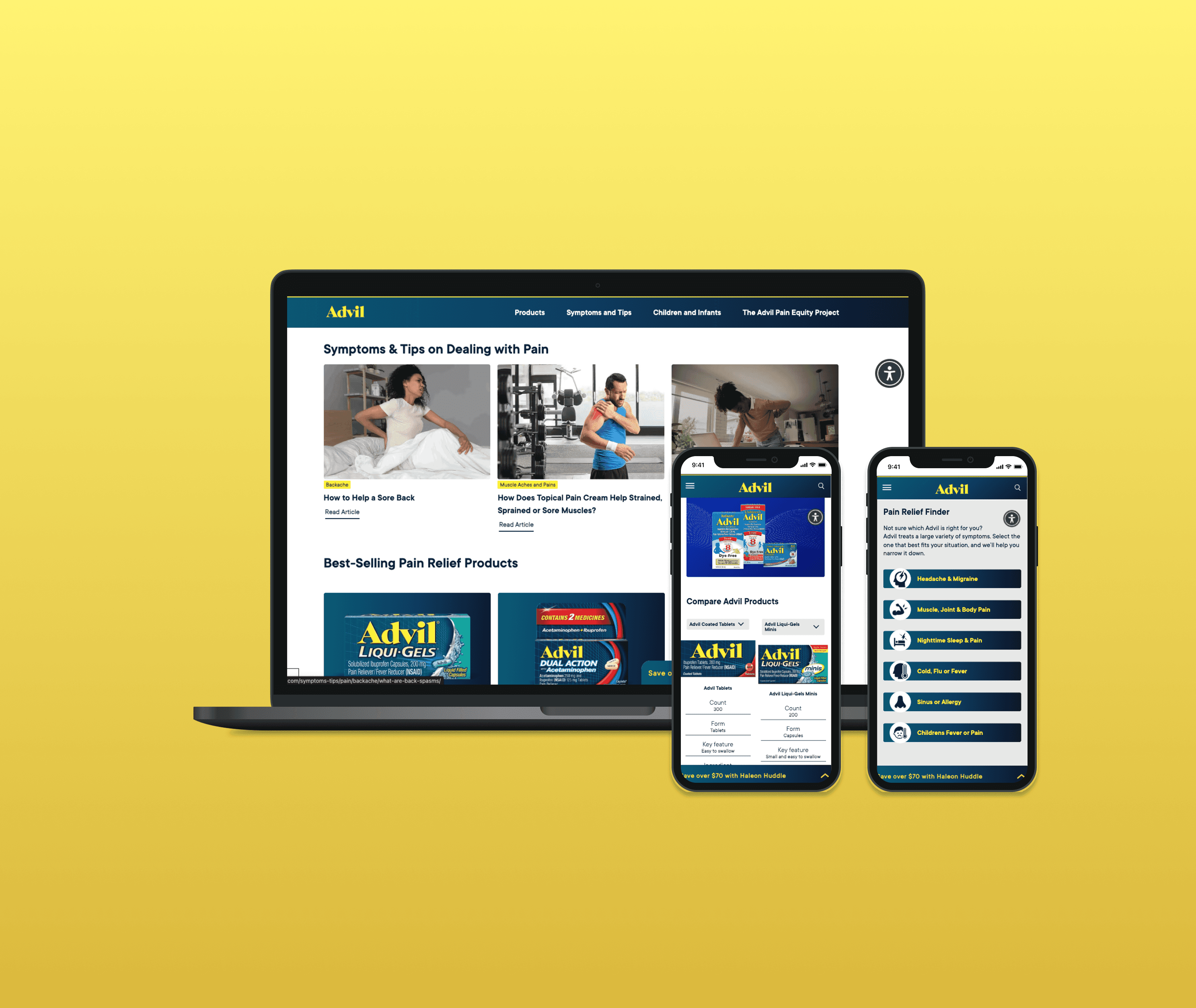
Outcomes
Advil was able to surpass their traffic by more than 50% from prior designs, as an outcome of a successful redesign merging 4 websites into a single address.
Outcomes
Advil was able to surpass their traffic by more than 50% from prior designs, as an outcome of a successful redesign merging 4 websites into a single address.
Outcomes
Due NDA compliance, I can't share data related information related to the design improvements, but from my personal experience, this project was a major improvement at:
- Streamlined design process
- Design and document artifacts
- Visual update to match branding
The new Delta Vacations Portal was released in 2021 and it's available internationally at Delta.com/vacations
+50%
Average traffic increase